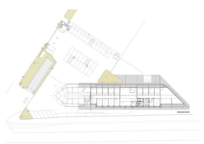
SITUATION: The statement made by the new HQ should correspond not only to the company’s policies like “Wood-Innovation” or modern technology, but also to the family tradition of adequate means. A balance is to be found between a down-to-earth company and its appearance as a global player. The solution can thus neither be total understatement, nor an excessive act of self-portrayal.
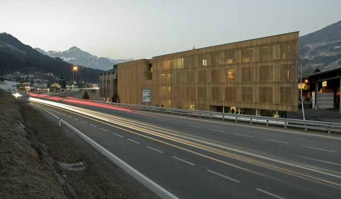
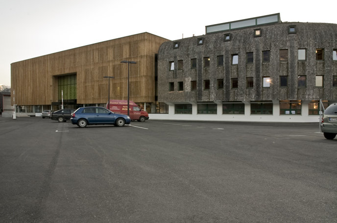
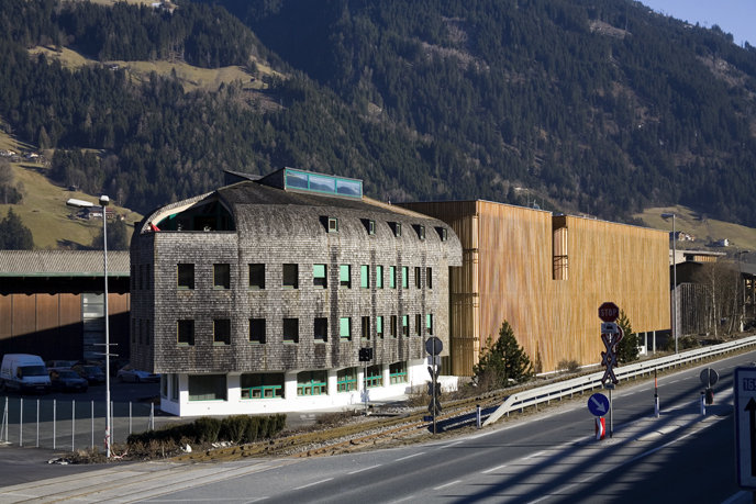
The existent building by Architect Josef Lackner as a strong Corporate-Identity-providing object (everybody knows him) is an artistic challenge.
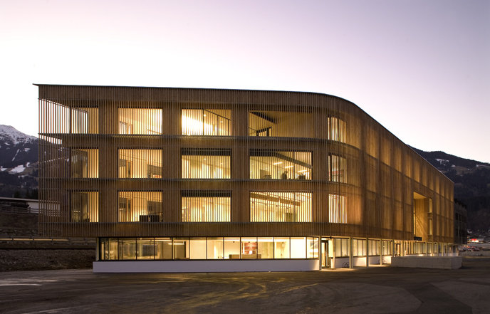
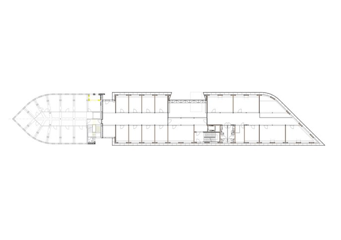
APPROACH: Due to the chosen building depth a variety of modern office-space-arrangements, like cell-offices, combi-offices or open-plan-offices, as well as “business club”, are possible. The available space is used to full capacity and the outline of the existent showroom is picked up and brought to a dynamic ending.
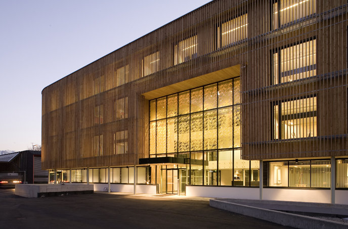
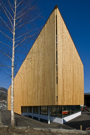
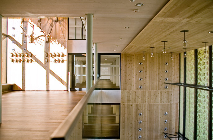
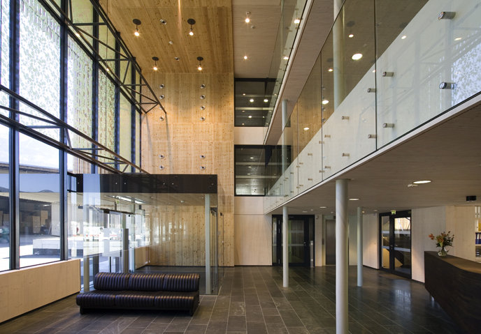
The entire exterior is covered (for most obvious reasons) by a wood batten – acting as a transparent curtain in line with the clapboard skin. This creates a distinctive homogenous body from the outside, and a lot of transparency from the inside. The warm, filtered daylight, which is partly shielded, supports an atmosphere of concentrated working.
Spatiality: On the side of the forecourt the existent arcade was consequently continued to the salesroom in the south - a token gesture of amicability.
The entrance hall - with a void connecting all stories of the building - forms a collective, ample center and creates a continuous flow of space that lets you "feel" the real dimensions of the building. A part of the salesroom was also designed two stories high, providing an appealing interconnection with the office area.
Another three-story-hall with "conference-niches"/conference rooms, seminar rooms on all levels marks the intersection between old and new.


